INSIGHT
During Ramadan there are 60M queries for “orientation to Mecca” or “Qibla”. Within Muslim culture it can be a hotly debated subject about “exactly” where Qibla is. Adding to this, the existing products available either frustrate the user with inaccurate results, have a poor user experience or both.
IDEA
Google wanted to help millions of Muslims to find the right direction to pray towards during Ramadan and beyond. Using Google maps and Augmented Reality, Qibla Finder, an in browser app, was born. No matter where in the world, Muslims will always know which way to pray.
SIMPLE AND ACCESSIBLE
We wanted to make a sophisticated yet simple tool that enables practicing Muslims to find Qibla quickly and accurately so they can carry on enjoying Ramadan.
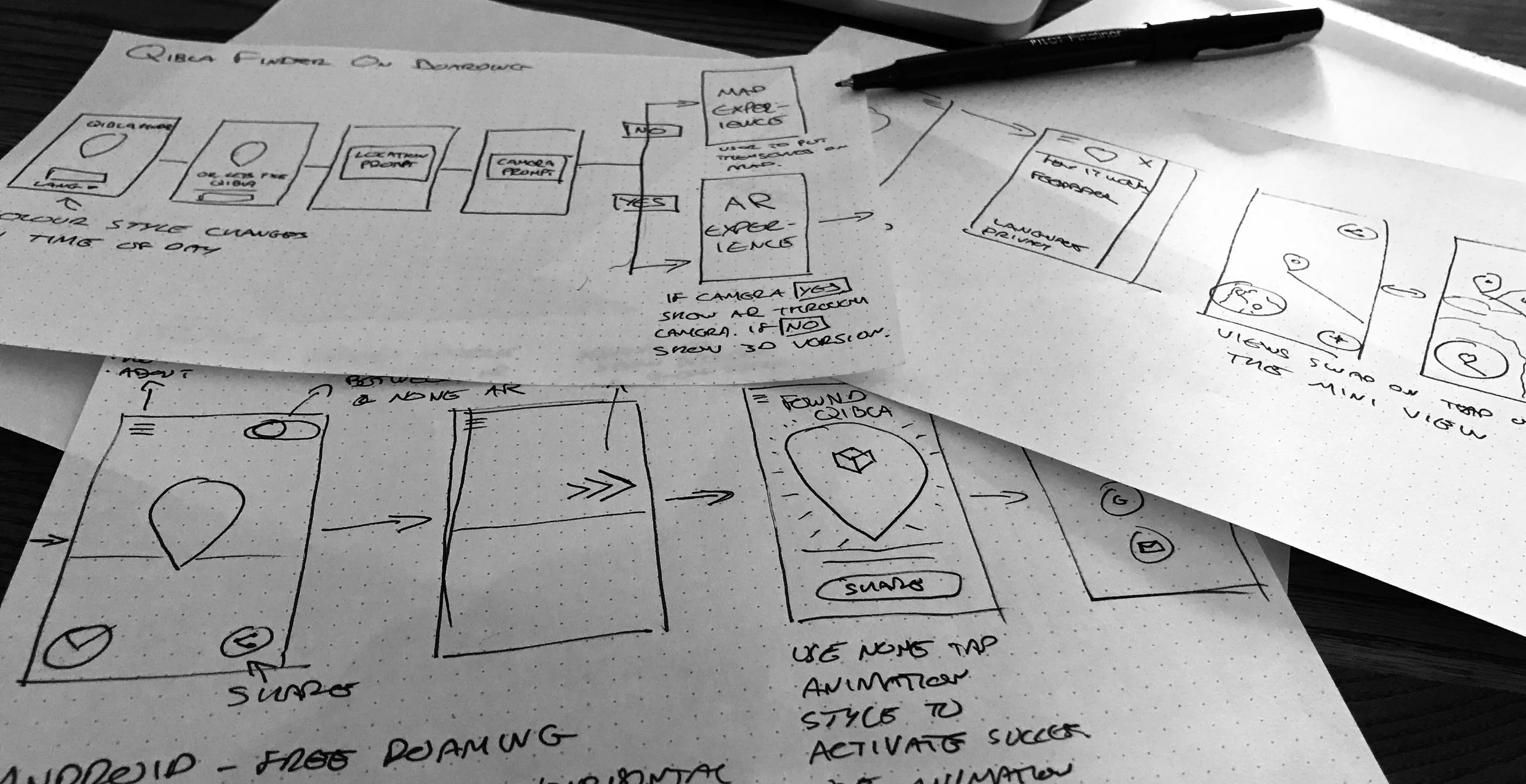
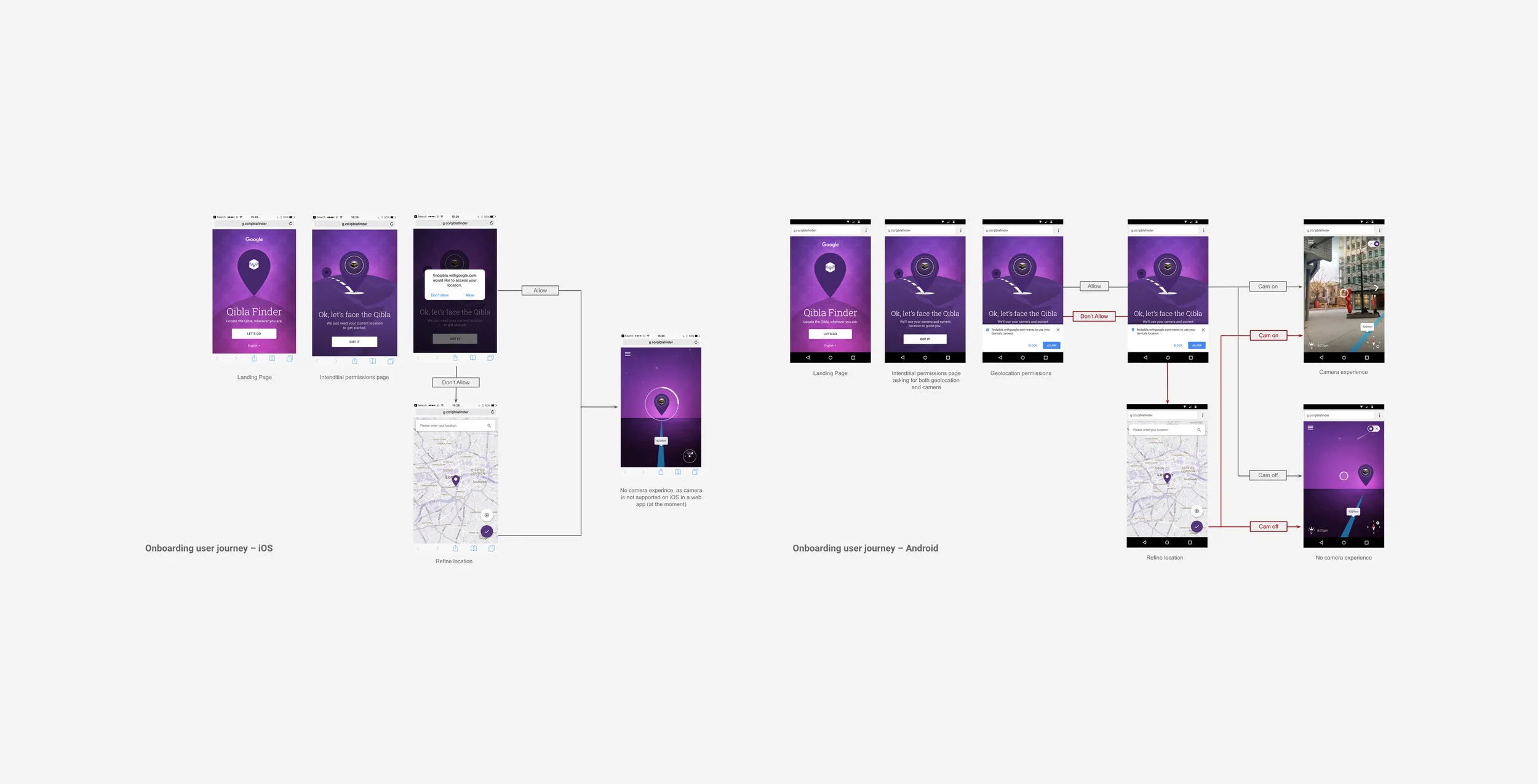
As a web app it increased the potential outreach to millions, avoiding any barriers to entry, like downloading a native app. We carefully considered how it could degrade gracefully ensuring everyone could utilise the tool by providing both AR and non AR versions.
CRAFT
Similar to most Google products, the beauty of the app is it’s simplicity and impact. We also wanted to make it beautiful and a joy to use, so we sweat the details at every stage from the on-boarding process, micro interactions to the language. We even changed the colour scheme of the app depending upon the time of day, since praying during Ramadan is determined by the time of day, making the app feel more in-tune with the user.
QIBLA FINDER 2.0
Off the back of the initial release of the web app, we listened to users feedback and implemented the most requested features for the following year.
This included turning Qibla Finder into a ‘Progressive Web App’, which enables the user to use the app when offline, being able to place it on the homescreen, receiving and sending real-time notifications. Adding satellite layer toggle to Map Views allowing users to toggle between the default map style and a satellite view. Improve messaging throughout by running an end-to-end user study to gain a better understanding of how users use the app.
AWARDS AND CREDITS
ROLE
Art/Design Director at Google BrandStudio


