
Website Refresh & Brand Evolution
GoHenry
Scroll
Website Refresh & Brand Evolution
Overview
GoHenry operates in a crowded market where most competitors are free. The old site wasn't justifying the fee — it was disjointed, visually tired, and rushing people into a funnel before they understood why they should care. We stripped it back, found the real story — a financial education platform giving kids a genuine head start in life — and rebuilt everything around that. The result was a site that earned the sign-up rather than just demanding it.
Bounce rate. People aren't landing and leaving — they're staying and exploring. Average session: 5 min 44 sec.
In-funnel conversion week one, vs 9.3% on the old site. Fewer people entering — but higher intent when they did.
Visitors needed for significance. We had 60k. Where data flags friction, we're already iterating.
01 — The problem
Outdated visuals, inconsistent design across pages, no design system, and a funnel-first architecture that pushed people towards sign-up before they'd understood why they should care. CTAs everywhere, message hierarchy nowhere.
The deeper problem was strategic. GoHenry charges a monthly fee in a market where Revolut <18 and Monzo are free. The old site didn't come close to justifying that. It felt corporate, cluttered, and frankly a little tired.
No brand presence
Too many CTAs, wrong leads
CTAs bypassing consideration
No design system
Built for crawlers, not people
02 — The strategic bet
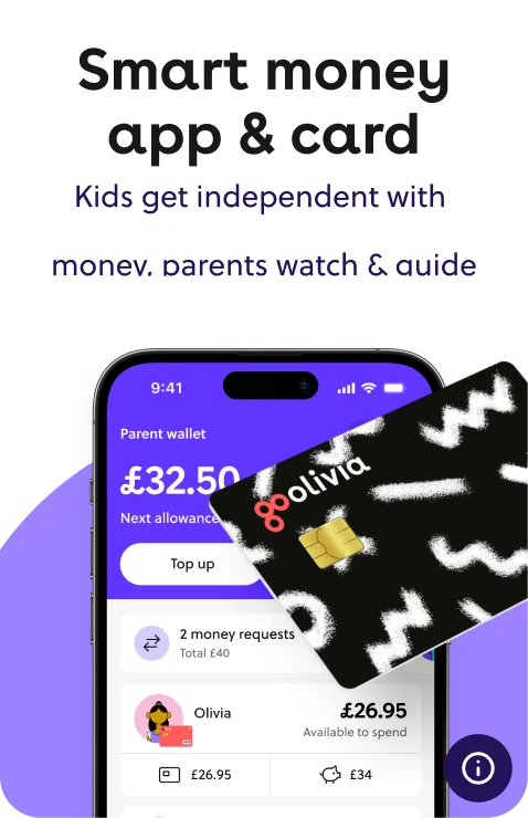
"The smart money app that teaches kids to earn, save and spend — with parents confident every step of the way."
Fighting on features wasn't an option — every competitor had a comparable set. Fighting on price was a losing battle from the start.
The insight was that GoHenry isn't really a debit card. It's a financial education platform for families — and that's something none of the free alternatives could genuinely claim. The fee isn't a cost, it's an investment in your kid's future. The site needed to earn the fee before it asked for it.
 The outcome
03 — The work
The old site wasn't communicating what GoHenry actually is — the smart money app that teaches kids to earn, save and spend, with parents confident every step of the way. Getting that message to land fast shaped every decision we made.
We restructured the IA from the ground up, giving every page a clear role in moving parents toward conversion — leaning into the emotional journey, meeting parents where they were, with a sign-up button present throughout but never pushy.
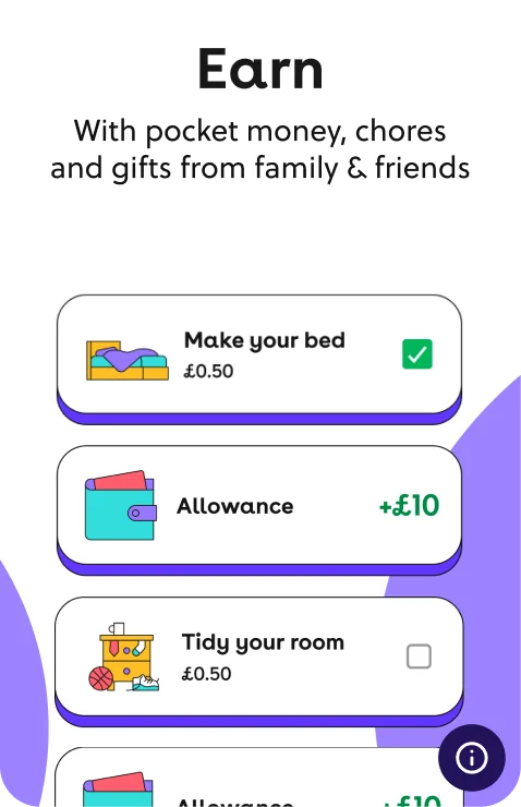
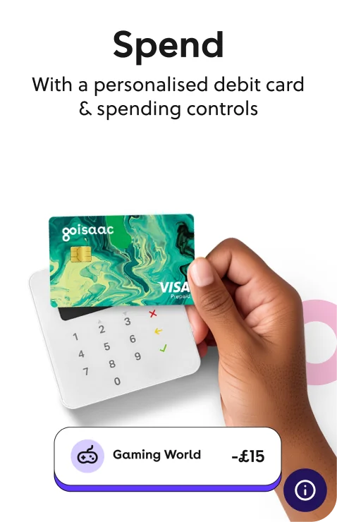
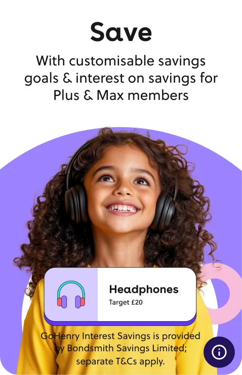
GoHenry's value isn't the card — it's what the card teaches. A child who earns, saves, spends carefully, and starts investing early doesn't just handle money better as a kid. They grow up wired differently. The messaging challenge was making sure every feature felt like evidence of that bigger promise, not a spec sheet. Earn, Save, Spend, Invest — each reframed as a step toward financial independence, so the whole site added up to something that felt genuinely worth paying for.
GoHenry offers a lot. So we were deliberate about hierarchy — research told us parental controls was the feature parents wanted first, so that's where the story started. Everything else was sequenced around it.
Trust was the real barrier. Polls showed parents weren't unconvinced by GoHenry — they just weren't sure they could hand over financial control to a non-bank. Trustpilot ratings and real parent testimonials were pulled out of the footer and placed where hesitation was highest, close to the decisions that mattered.
The site had a lot to communicate and the risk was obvious — drop too much on a parent at once and they'd bail before getting to sign-up. Our hypothesis was progressive disclosure: cards that lead with the headline benefit, and let the curious flip for more. The idea felt solid. Less cognitive load, same depth, on the user's terms.


The design had to feel premium — GoHenry is a paid product, and the experience needed to justify that fee and build long-term trust. A new design system brought consistency to every touchpoint, and the visual overhaul gave GoHenry a look that finally matched the quality of the product behind it.
The site in motion
04 — What we learned
What didn't work first time, what the data told us mid-project, and what we'd do differently.
01
Nobody flipped. The data confirmed what we should've assumed earlier — time-poor parents want answers fast, not a mechanic that asks them to dig deeper. Right problem, wrong solution. So we moved to stacked cards with cleaner hierarchy and tighter copy upfront — which is proving more successful.
02
Post-launch, conversion from site to funnel entry dropped 0.9 percentage points (17.5% → 16.6%). The mobile nav jumping position on scroll was creating visual noise at the worst possible moment. We tested fixing it to the top — a more stable UI, less friction, better funnel entry.
03
Early pages went live before the system was fully baked, which meant retrofitting consistency later. Building the system first — even just foundations — would have been slower upfront but faster overall. Ship the tokens before you ship the pages.